 Well, wasn't perfect. Colour matching them was pretty annoying.
But this is for the 'Out of Place Celebrities', what better then a future meets past concept ¯\_(ツ)_/¯
0 Comments
 Aparently the teacher likes this the most. 'Music Festival Poster', me being bit of a weebu thought of 'You Lie In April', makes the background easy, cropped one of the posters to make it look real 'artistic'. Made the writing look a little like the cherry blossoms, and ordered the condentents in the way they were ordered in the anime finals.
 City in a Box.... took me forever to find a box.. ended up just sculpting one a little. Well at least the colours blend nicely
 Task: create a pop art Tshirt design.
Not really pop art... But it look pretty, its a Tshirt design, and it look pretty :3  In a project we were suppose to do a folio on a living artist and try out their style, but since most of the artist are anomynus, i decided to just find a style i liked and try it myself.
And here we are, Fractal art Wolf (don't be too supprised, i did trace the outline, not use to using drawng pad.)  A mix of both term 1 task 3 and term 4 task 4, decided to do a skyrim flag in the skyrim sky with a dragon, and here it is.
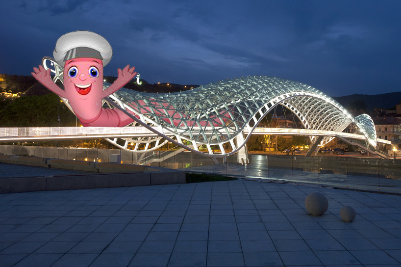 In a school mini project i had to take a bridge and put someone on it, when i found this pretty cool bridge i chose it as i'm a little hipster and don't want to do what everyone else was with bridges like Sydney bridge and Golden Gate. Then in search for something to go in it i was thinking a worm or snake crawling out, and when i found Wormy i thought it was perfect.
I used select tool to copy the front of the bridge then pasted it on a layer on top of wormy. Then i erased the gaps in the bridge to show wormy through. the i shaded wormy to match the area a bit more. |
AuthorDemonition Archives
November 2016
Categories |
 RSS Feed
